COS Studios
A one of a kind studio that became more than four walls
Role: Brand & UX/UI Web Design, Experiential Design, Art Direction
Timeline: January - July 2022

Candace came to me with an idea.
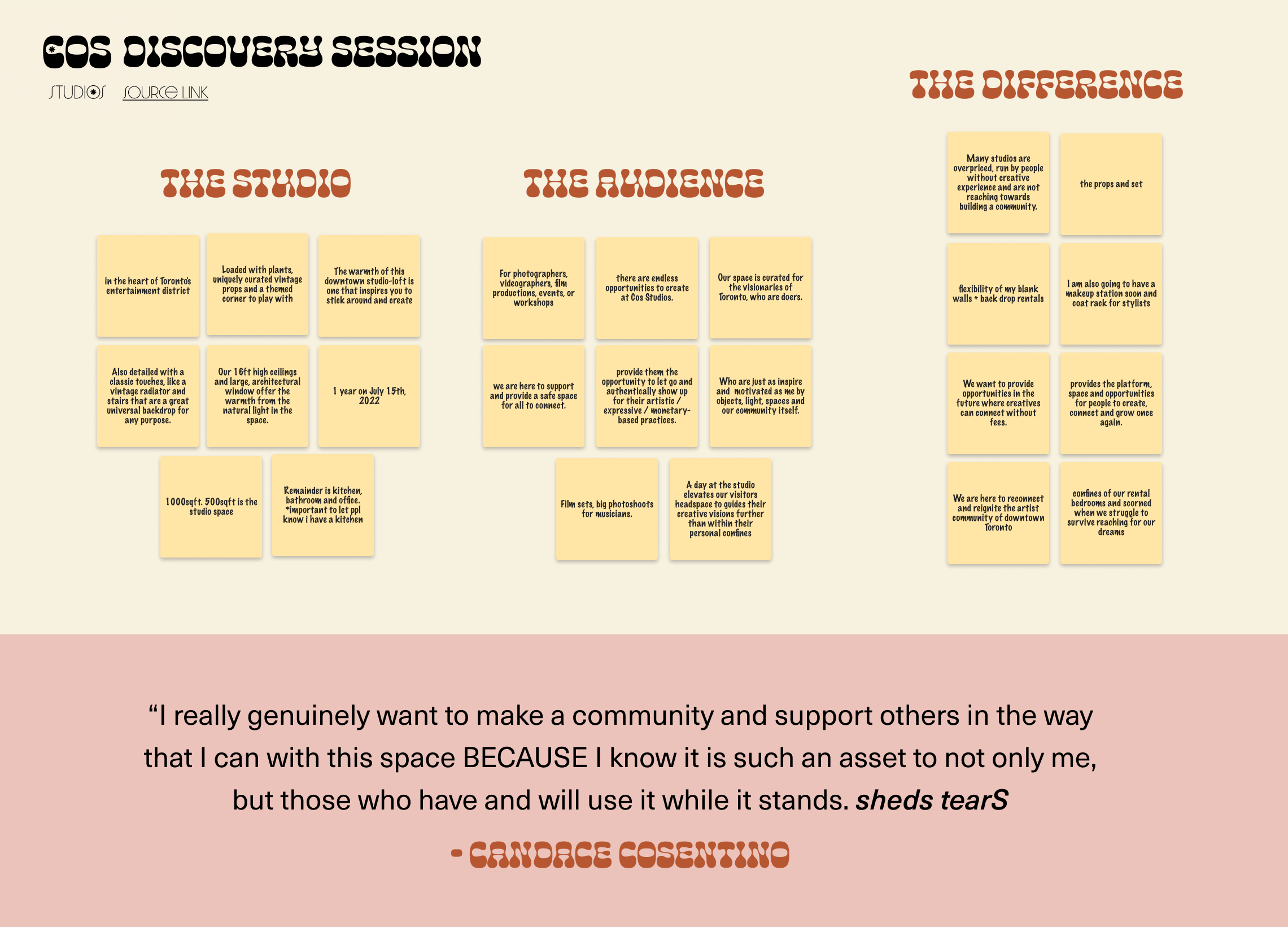
She wanted to create a fully creative rental studio experience for clients and creatives to feel at home. From photography to workshops, the end goal is to create a creative community willing to learn, grow and support each other in Toronto.
Cos Studios must differentiate itself from other well-known and established studios in the Toronto downtown core. As a relatively new studio, Cos Studios needs to gain the trust of other photographers and brands in order to spread brand awareness and word-of-mouth referrals.
Why?
While we slowly emerge from social isolation, many are looking to either reconnect with others, get back to previous creative habits or create new work. Through extensive research completed by competitive analysis, we noted that many of them do not offer a community. Users are able to book a studio session and use the props available but the touchpoints end there. With COS Studios, we chose to feature the creatives that took the time to book with us, host networking events and celebration parties, as well as create opportunities for users to exercise their creativity through workshops.
Hypothesis
By creating a brand that aligns with both Candace’s personal beliefs and her ideal target audience, we would create a successful and engaged community. The location of COS Studios was in the heart of downtown, meaning from the moment COS Studios was established, the stability of the studio could be compromised by condo developers at any point. This is what made community, all the more important.
In October 2022, COS Studios received its eviction notice.
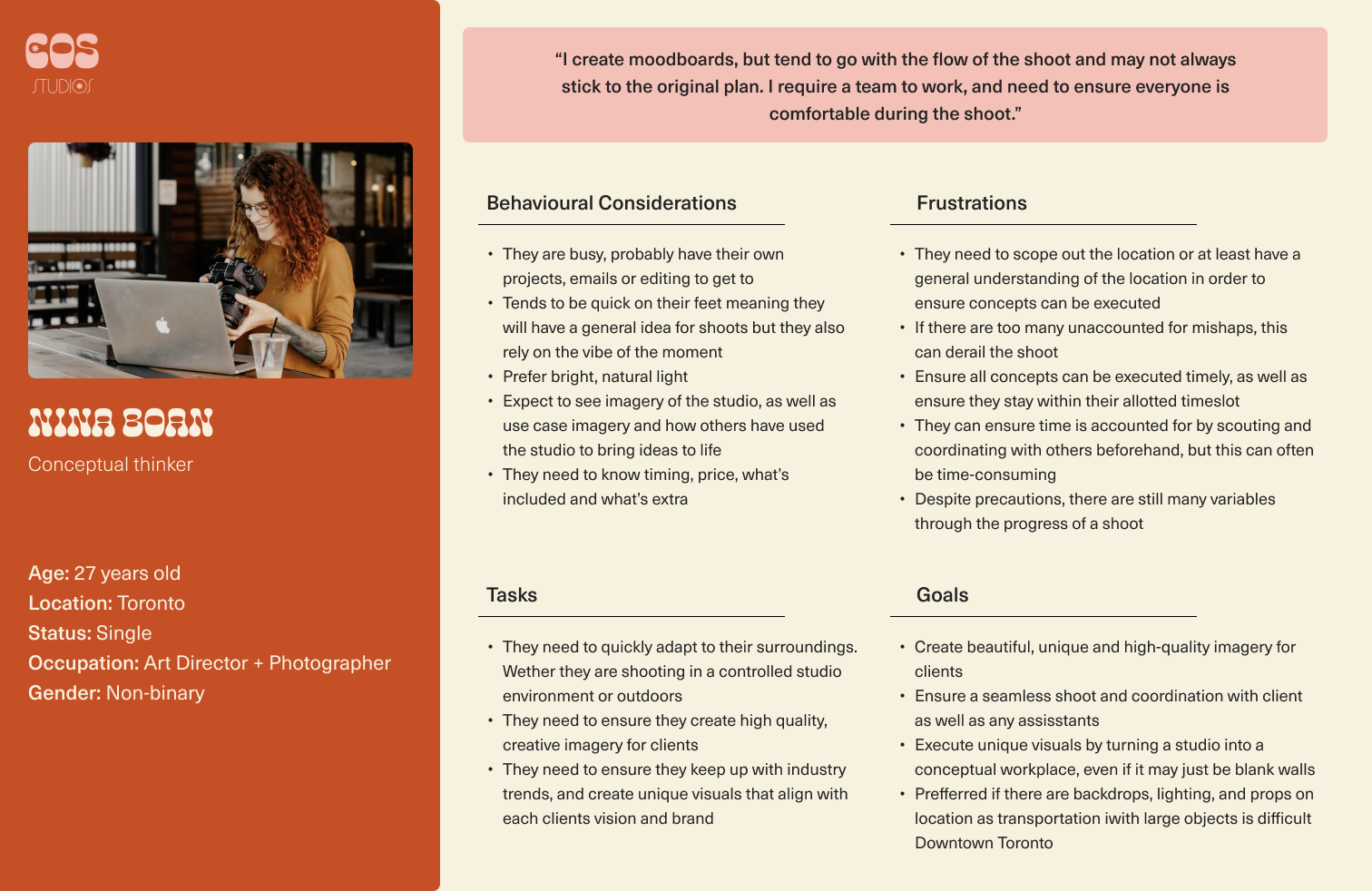
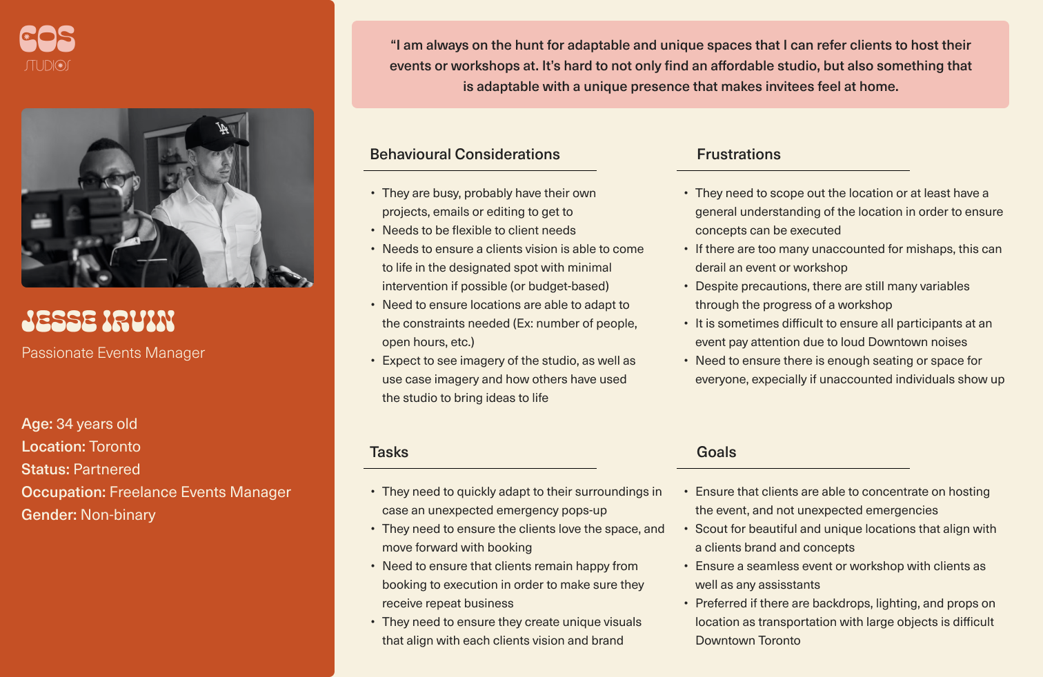
Competitive Analysis
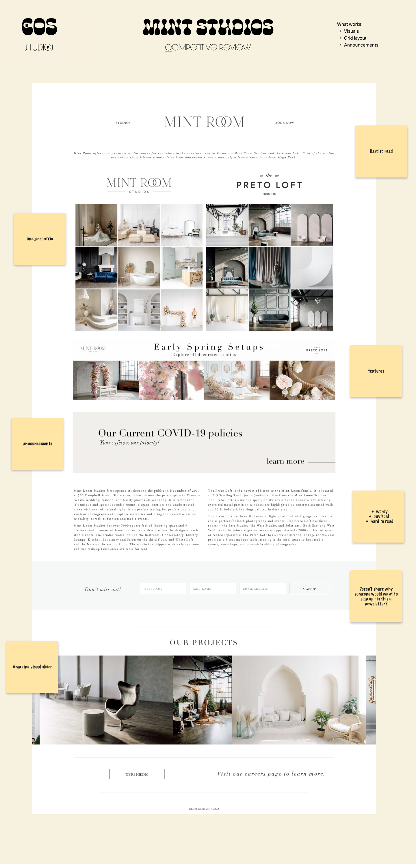
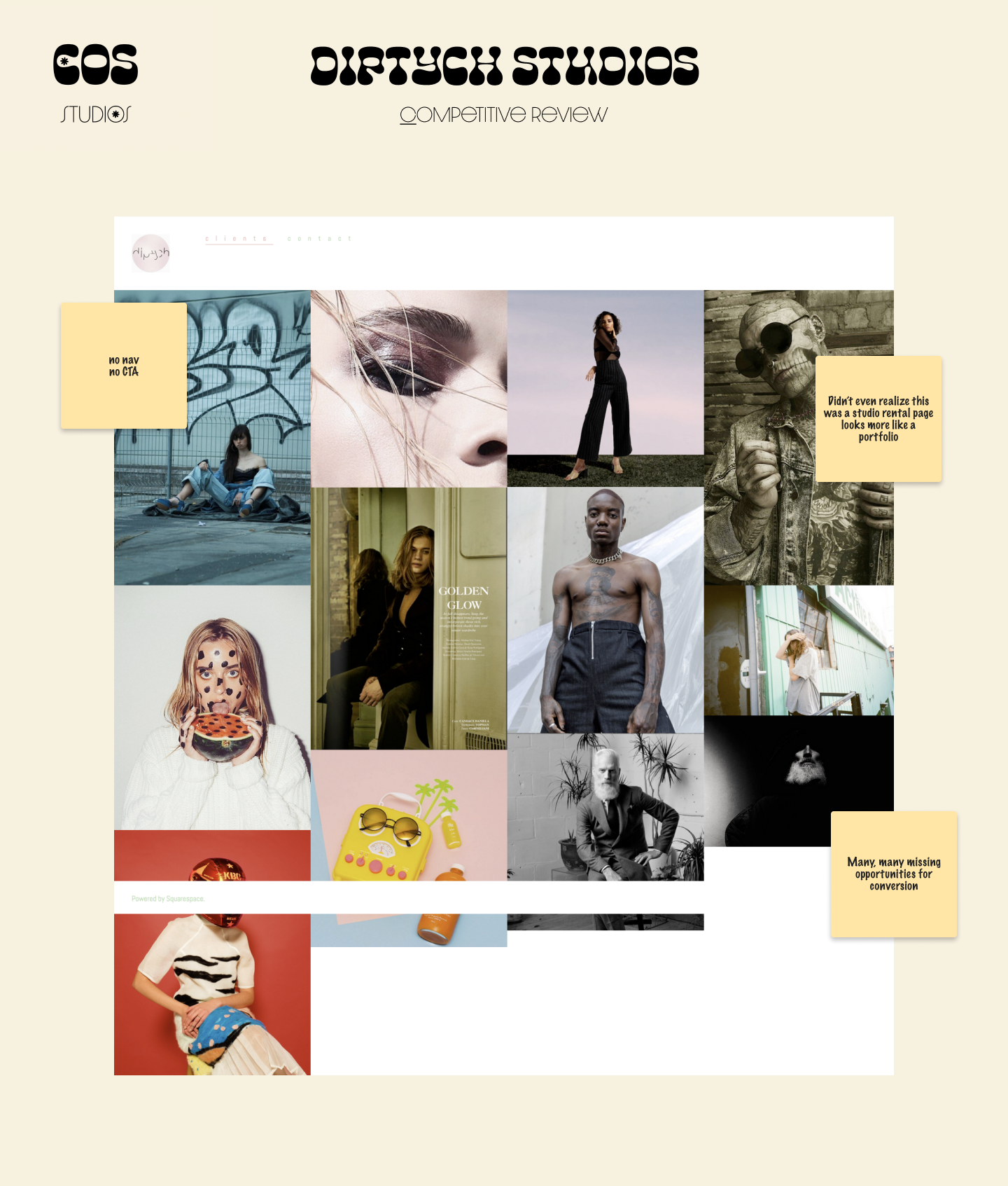
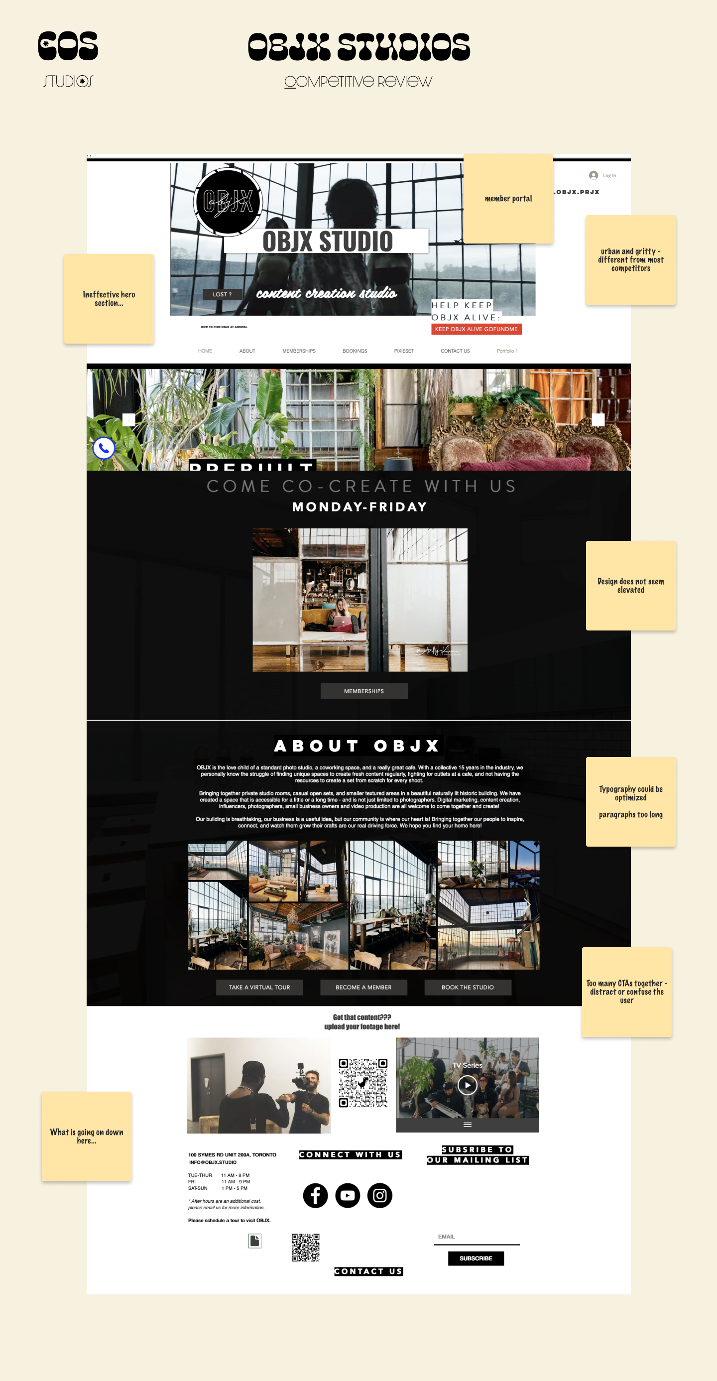
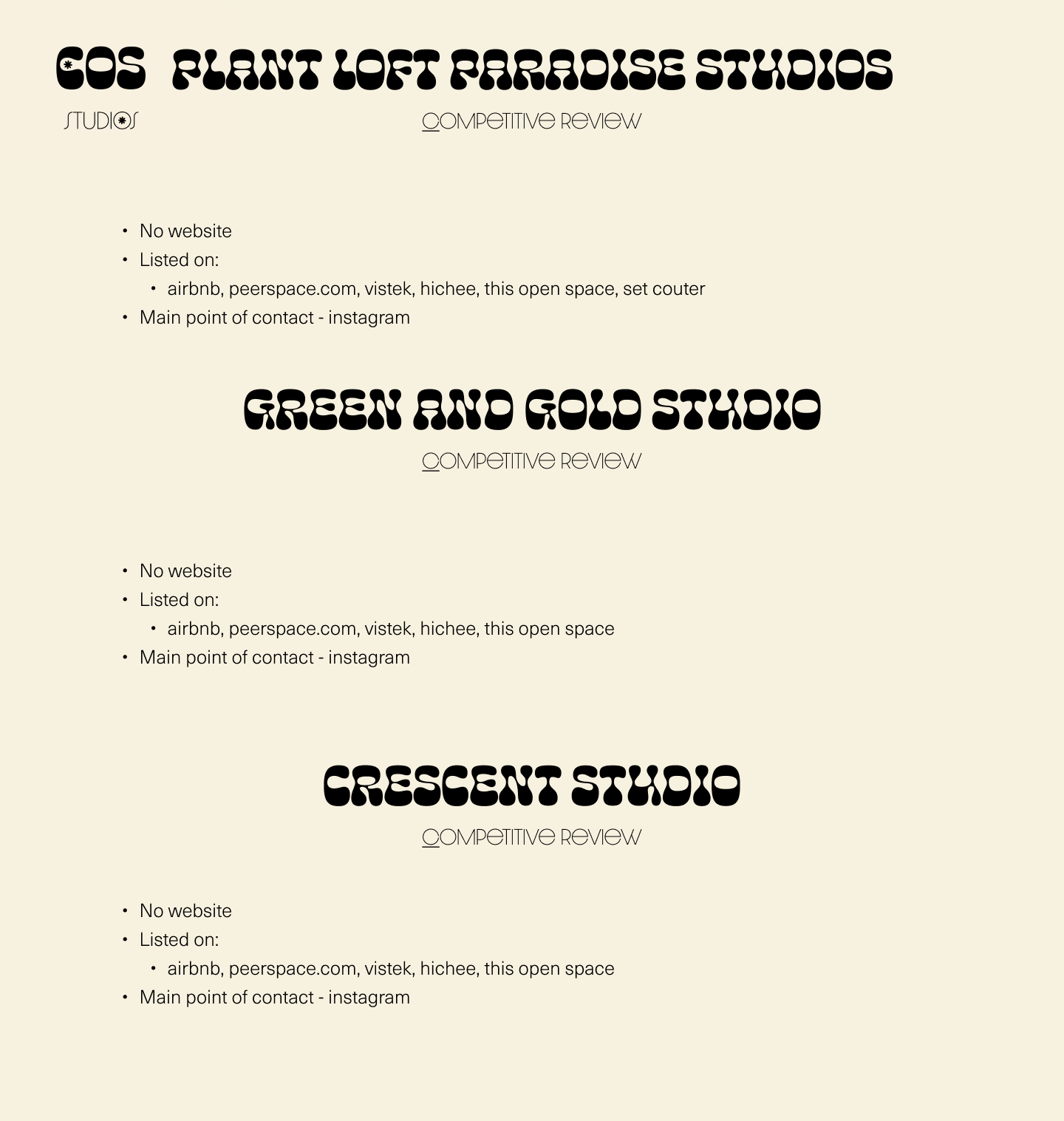
Through analysis, we noted that all studios keep minimal, clean white walls and are transparent about pricing and hours. Many studios tend to be in the Dupont area, West end or East end but nothing prominent stands out in the core downtown area.
All branding is minimal, with black-and-white colour schemes and sometimes an accent. Logos tend to focus on being typography-based with not much creative branding behind them. They tend to let the studios speak for themselves through photography seen on webpages.
I looked at the most popular studios from word of mouth, organic google search to what’s recommended on BlogTO.
Target commercial clients, generally bigger brands that are looking to create original content.
Focus on making the creative process seamless, and see themselves as “space facilitators.”
Target industry professionals - but call their studios a “boutique” as they are able to meet client needs, no matter how small and with complete attention.

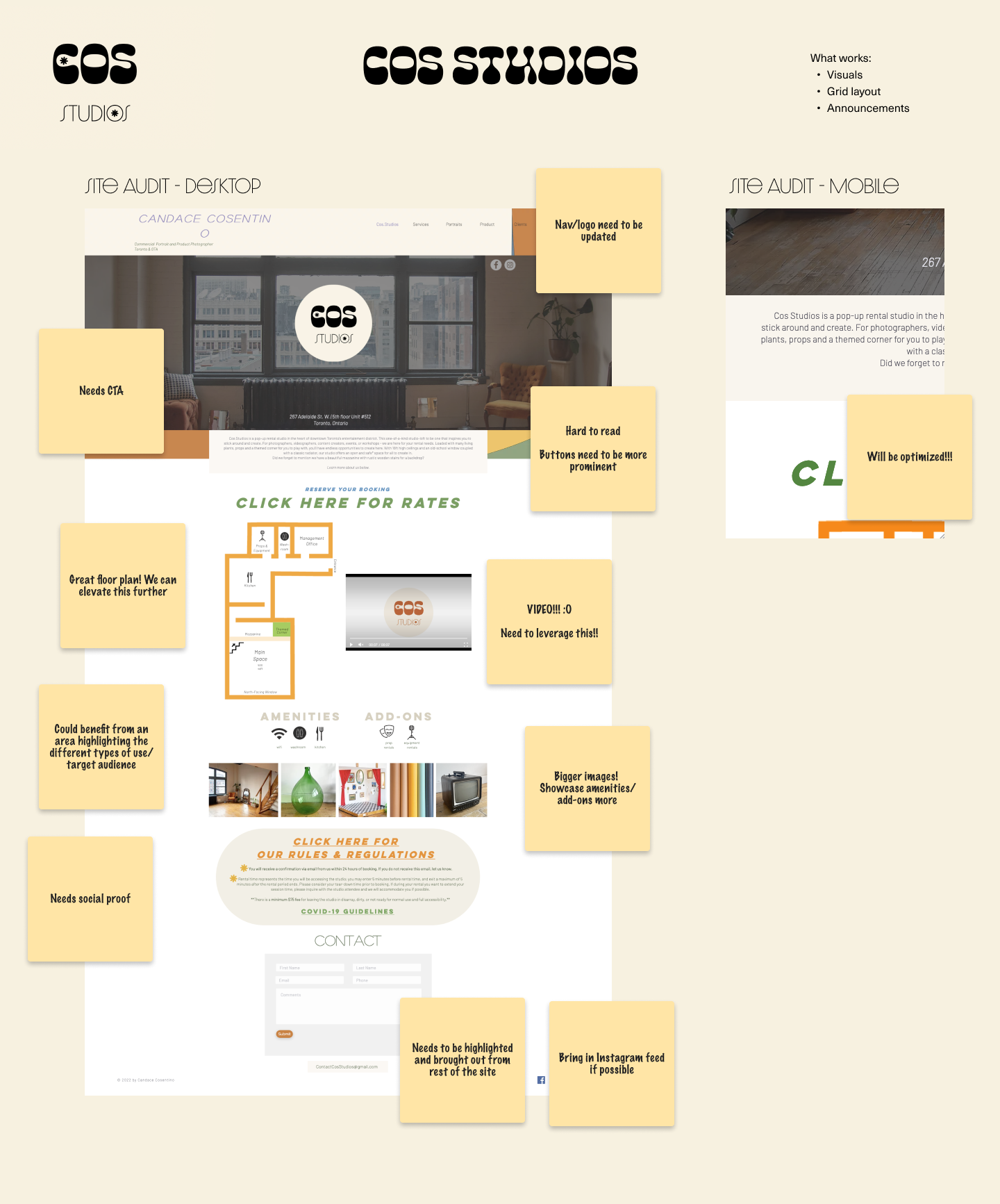
We conducted a site audit in order to align on the changes that were to be made as well as identify what was working or not at the time. Together, we decided on:
A focus on relevancy and ensuring a competitive edge in an already saturated market.
COS Studios will serve as a personal studio for Candace to express herself and work in, but will also ensure that time, money, and investments are fruitful, scalable, and sustainable long-term.
Welcoming and inclusive
Empower creatives with an environment where they can express themselves
Connect artists with each other by featuring collaborations
Host workshops, events, and studio sessions
Rotating theme corners and curated vintage furniture
Encourage an aesthetic playground with no boundaries
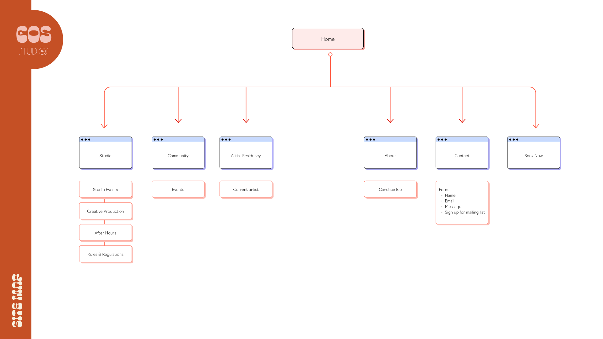
Site Map
By creating a brand that aligns with both Candace’s personal beliefs and her ideal target audience, we would create a successful and engaged community. The location of COS Studios was in the heart of downtown, meaning from the moment COS Studios was established, the stability of the studio could be compromised by condo developers at any point. This is what made community, all the more important.
In October 2022, COS Studios received its eviction notice.

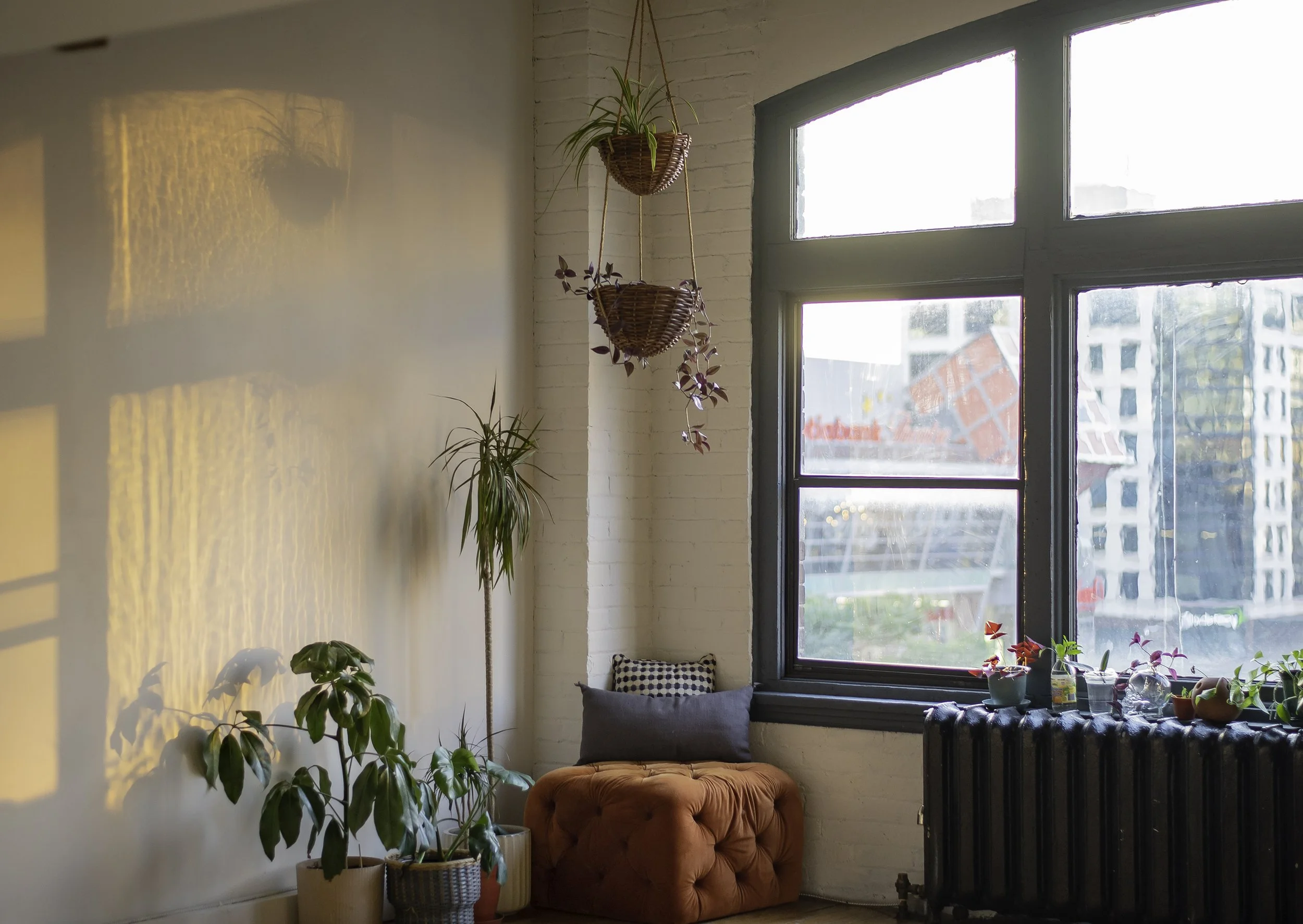
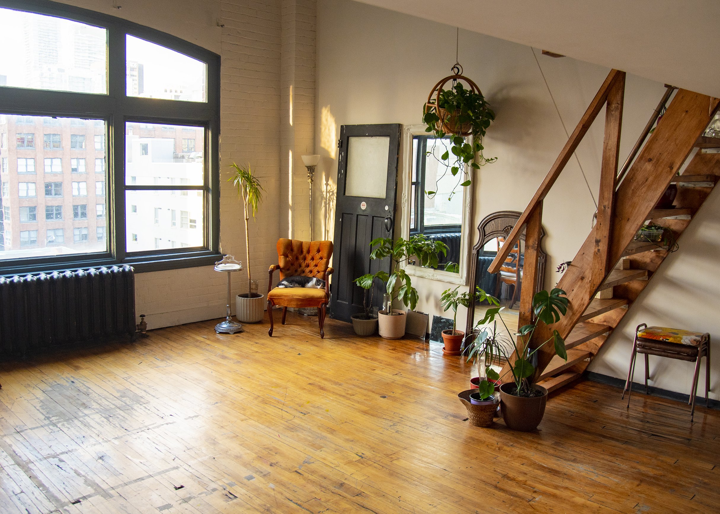
Cos Studios is a pop-up rental studio in the heart of Toronto's entertainment district. The warmth of this downtown studio loft allows you endless opportunities to create.
COS Studios focuses on a warm and friendly approach that makes you feel at home. From the 70’s inspired typography to the funky and bright graphic elements, it is portrayed as a safe and supportive space for all creatives in order to make their visions come to life.
How was it created?
Ultimately, based on the competition we focused on a friendly and grounding brand that will make you look twice. With a focus on typography, neutral (yet vibrant) colours, and an emphasis on “going back to the basics” through vintage ideals the COS Studios brand was born.
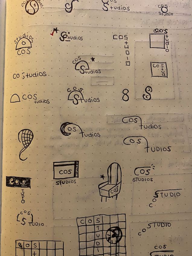
Candace always envisioned a vintage-inspired logo but we also played around with simple line art textures, gradients, primary colours, and a play on words.
Brand Exploration

Typography
Typography

Colour
Palette
Colour Palette

Hi-fi
Wireframes
Hi-fi Wireframes



Experiential
Design
Experiential Design
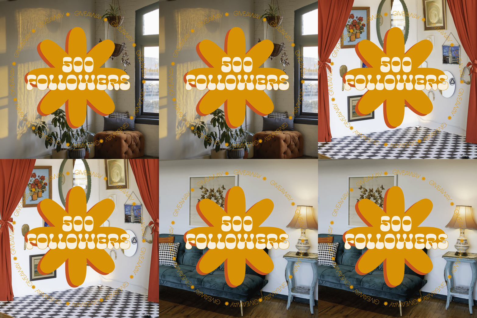
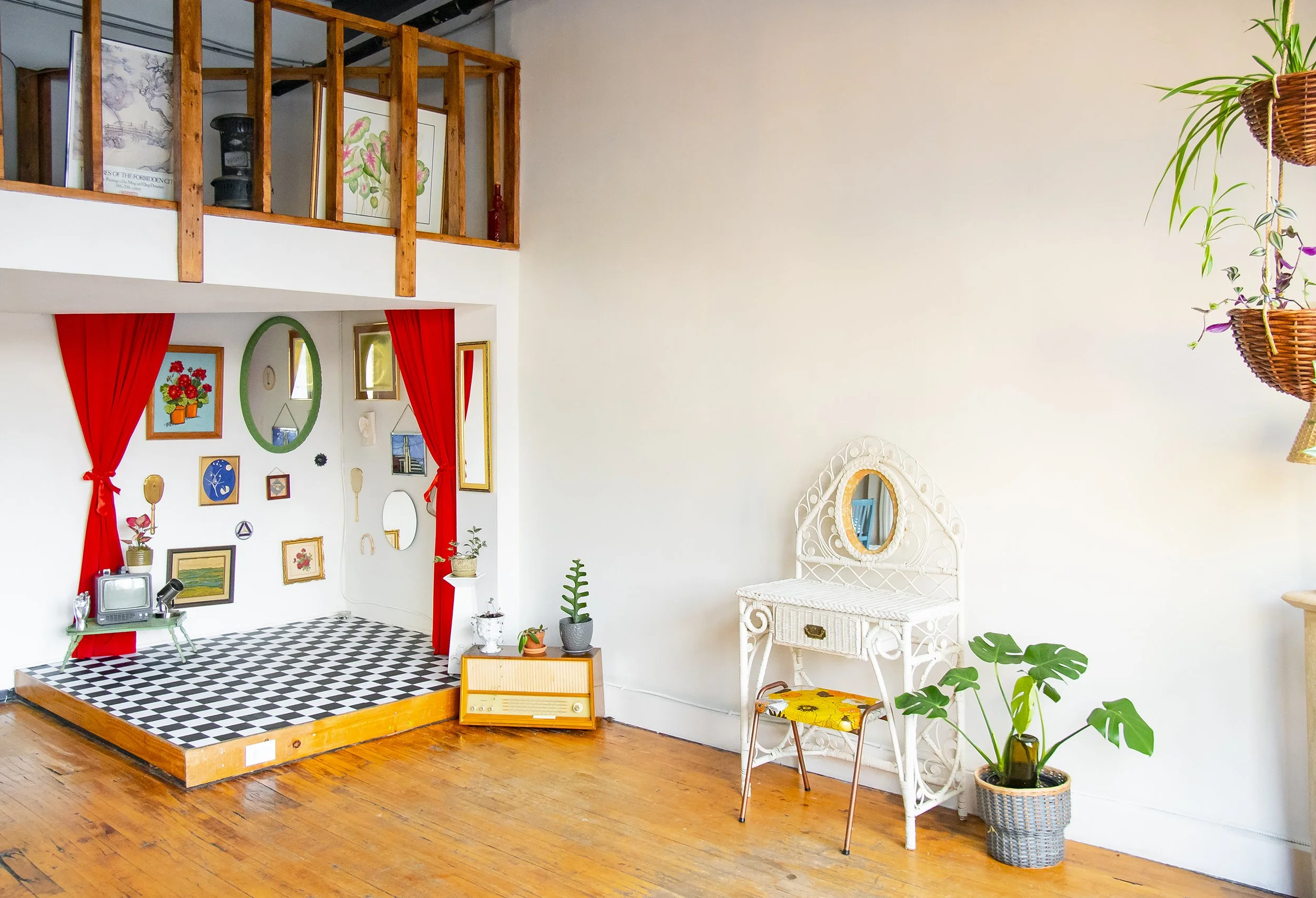
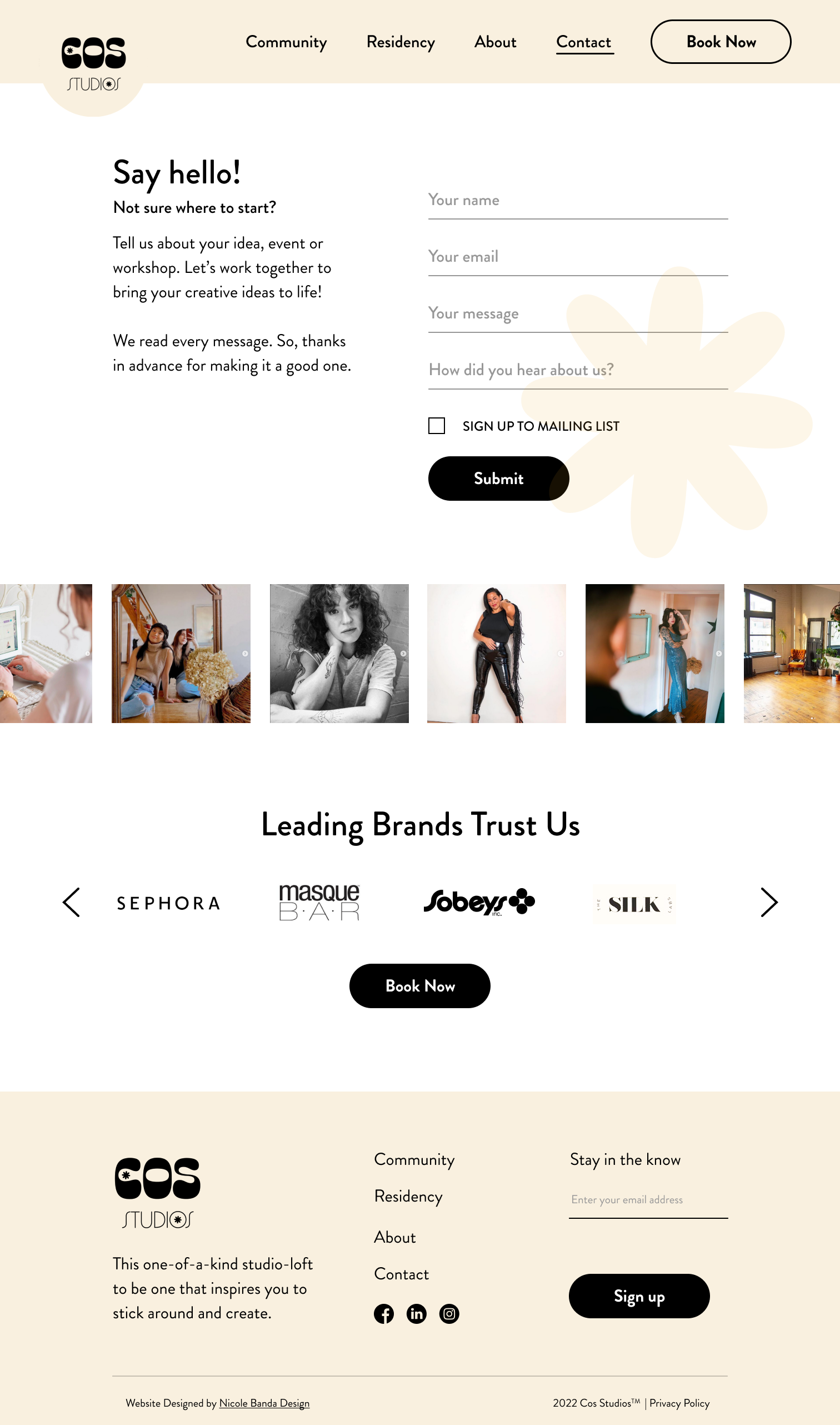
COS Studios has a special theme corner that rotates every 3 months. We conceptualized two versions.
As a lover of abstract art,
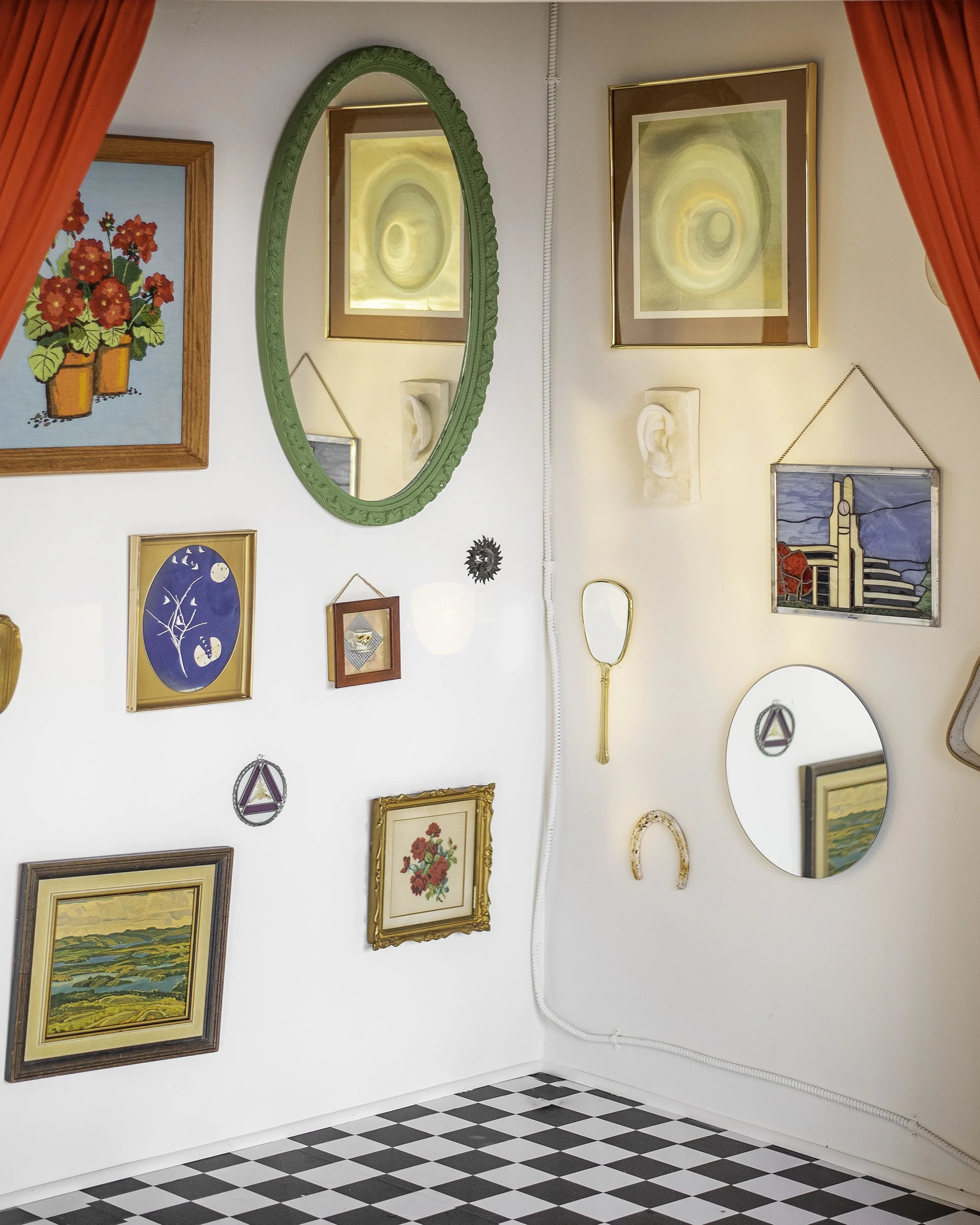
from Rene Magritte’s surrealist paintings to David Lynch’s Twin Peaks we decided on a “Black Lodge” themed corner. This corner included a checkerboard floor and red velvet curtains. Behind the curtains, there was also a mirror gallery wall, this way clients had many opportunities to be creative without restrictions.
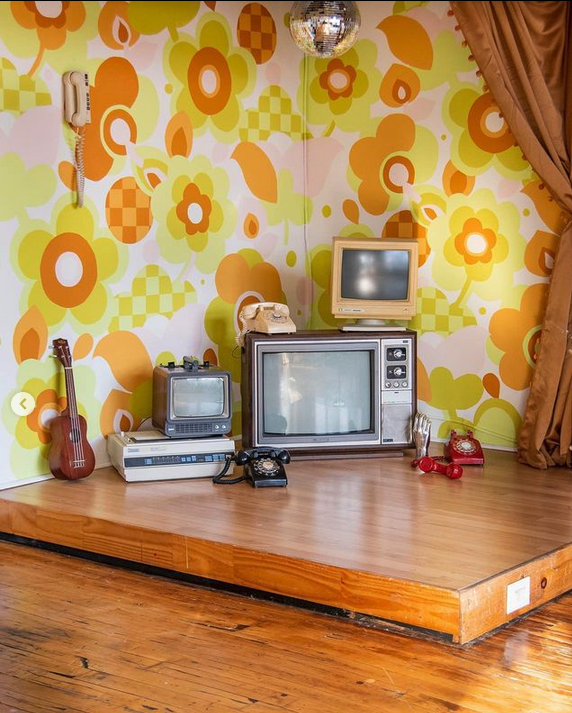
As a lover of the 70s and vintage,
Candace and I searched high and low for the perfect vintage wallpaper, from Etsy to Ebay - you name it! In the end, after a couple of disappointing purchases, we decided to work on a mural together. Inspired by soft colours and a 70s floral vintage kitchen this soft-toned floral and checkerboard mural came to life after a weekend.


