Ourco
Where communities make decisions.
Role: UX/UI Design + Management
Timeline: September 2023 - November 2023
Ourco needed a platform that empowered businesses to manage a flexible, collaborative workforce while meeting the demands of modern employment. The challenge was to create a solution that balanced ease of use with scalability, supporting both employers and employees.
Business opportunity
By doing so, they aimed to tap into a significant business opportunity:
Empowering companies to attract top talent through more flexible work models
Helping businesses streamline operations
Improve employee retention
Enhance overall productivity.
Why?
Ourco wanted to transform the way businesses engage with their workforce by providing a platform that promotes flexibility and collaboration. They aimed to address the growing demand for modern employment solutions that empower both companies and employees to thrive in an evolving work environment.
Competitor Analysis
Takeaways:
Many competitors seem to create overly complicated UX, leaving users confused and worst-case deleting the app (and leaving a bad review!)
Users of community apps know that they have to give up a decent amount of private information in order to join, but if they notice an app using it in sinister ways they tend to lose trust in the app/brand and ultimately leave
Most of these apps tend to do one thing well and it’s either a focus on social media (commenting, likes, messaging, etc.) or a focus on community
Apps that focus on fully signing up first with complex sign-up criteria are more likely to have users fall off and not complete registration
Recommendations:
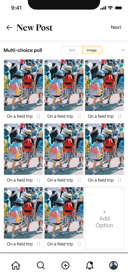
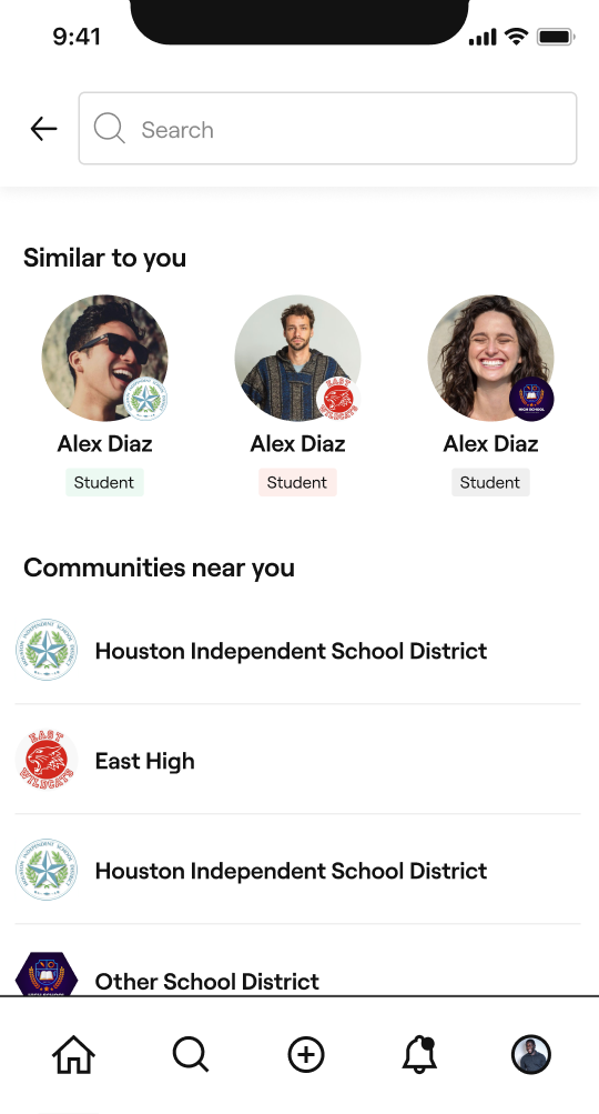
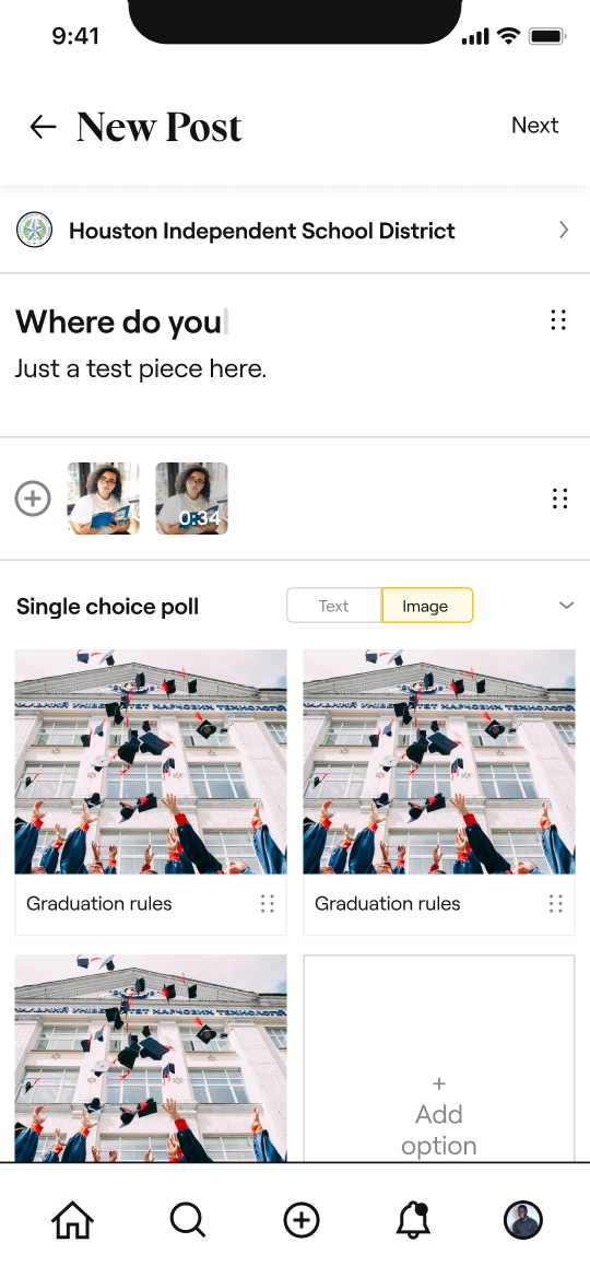
Opportunities to simplify app UI, and ensure that elements remain intuitive and not hidden or overly complex
Create a way to increase user trust in both the app + brand, which can be done by showcasing community activity or a variety of posts
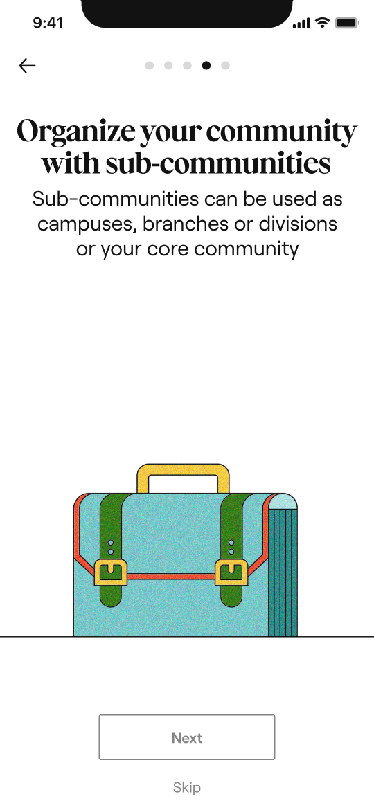
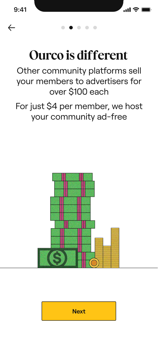
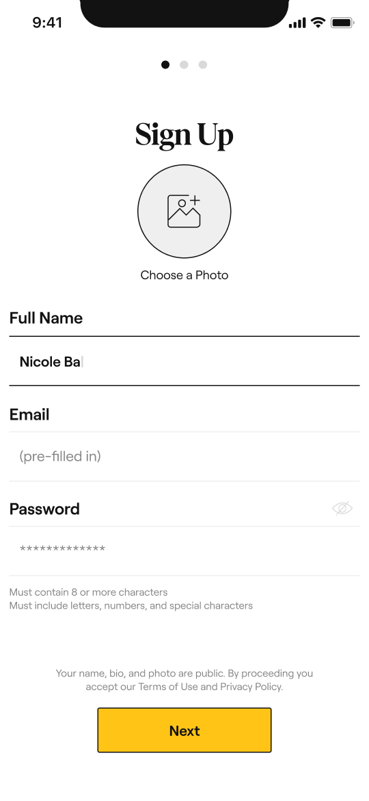
Fun registration and onboarding flows, that give you a peek into app features even if you are not fully signed up
Less focus on leading users (which might make app use feel like a chore) and more focus on allowing for organic exploration throughout the app and communities
Lo-fi wireframes
Lo-fi wireframes
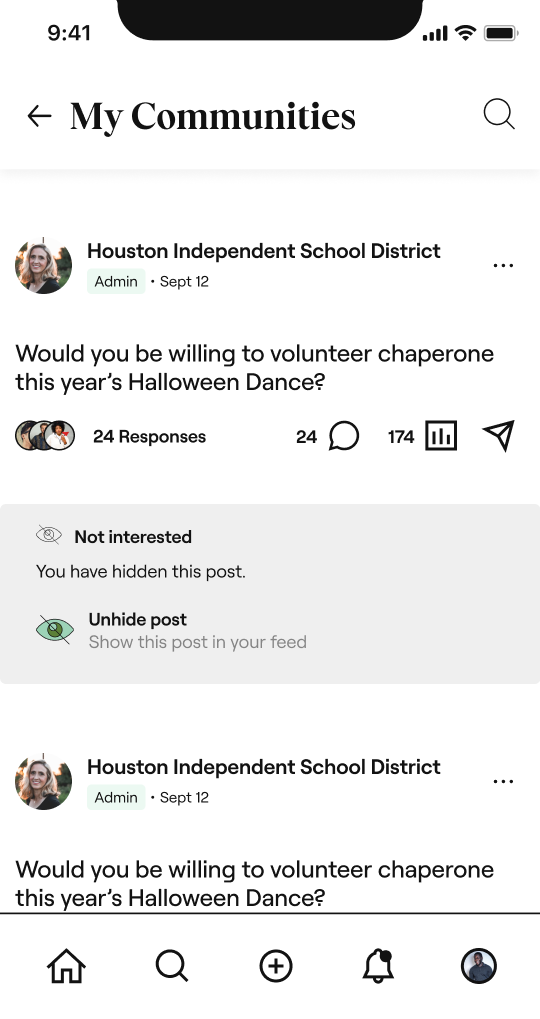
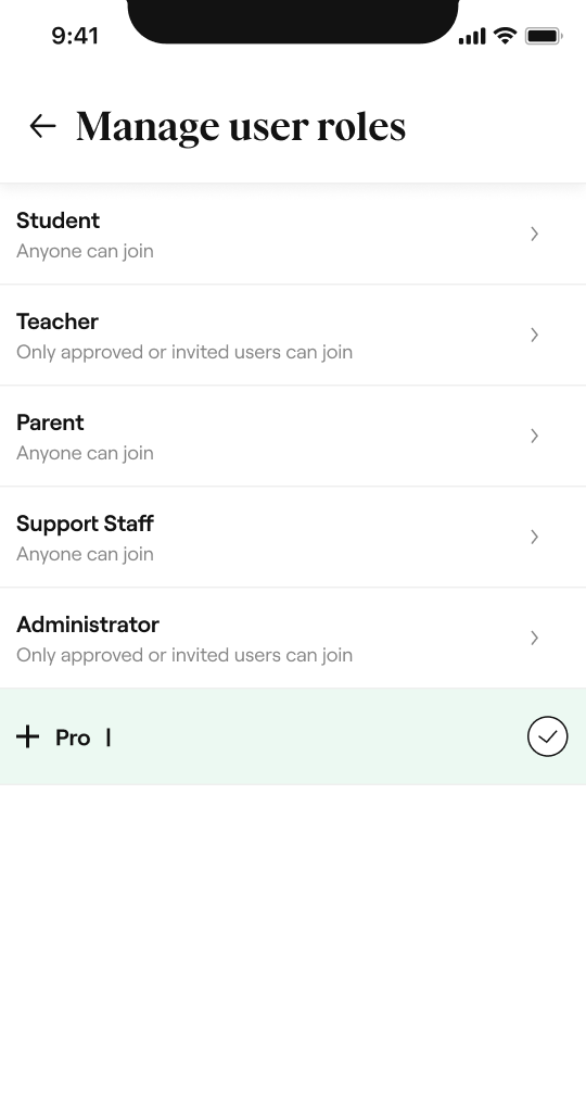
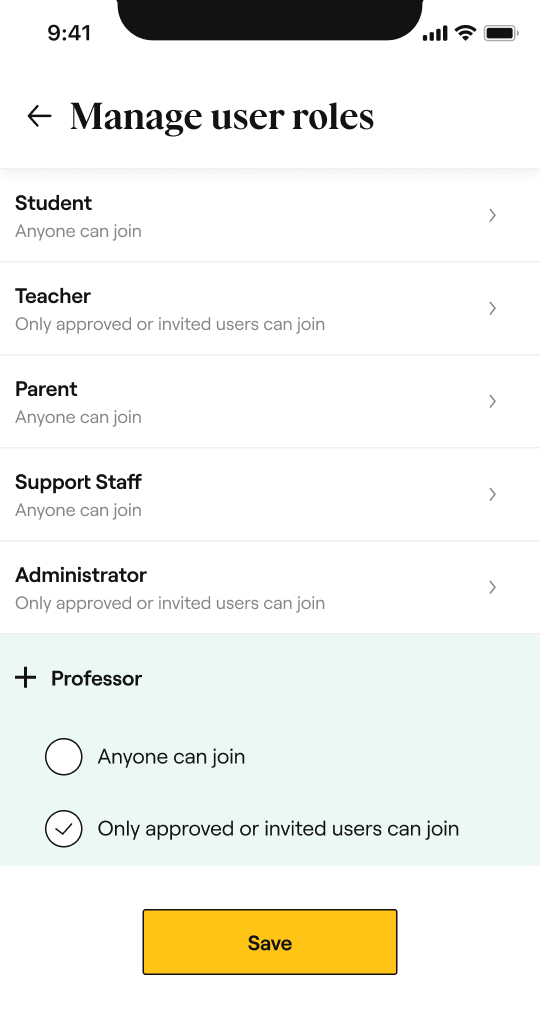
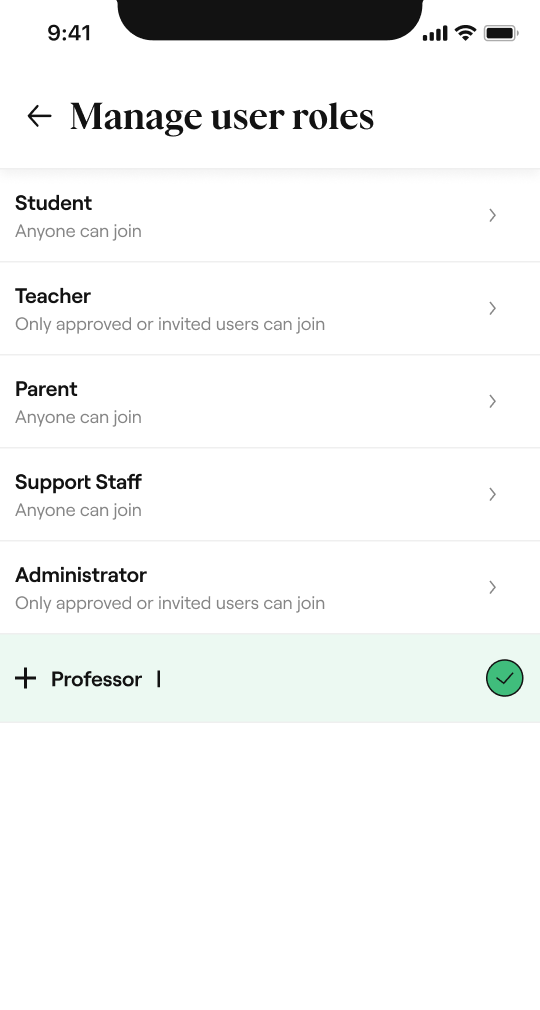
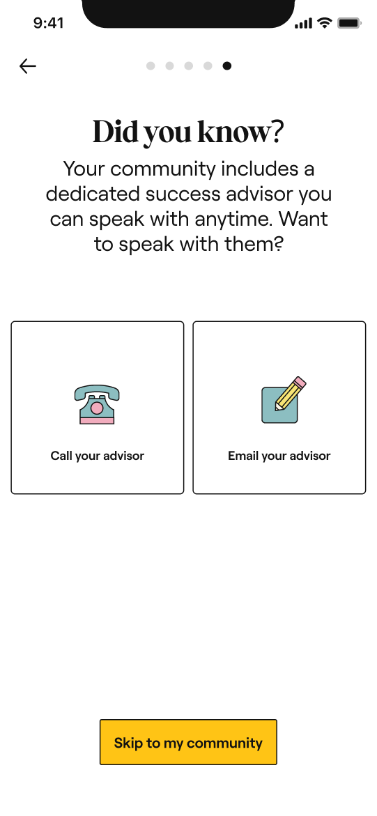
Hi-fi wireframes
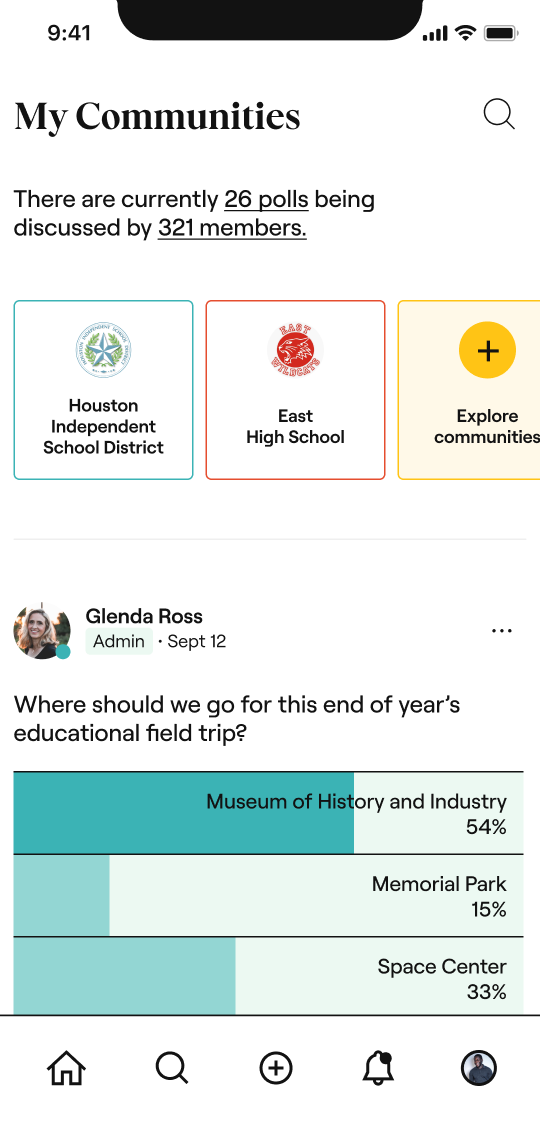
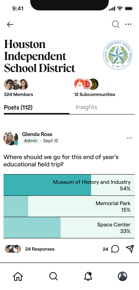
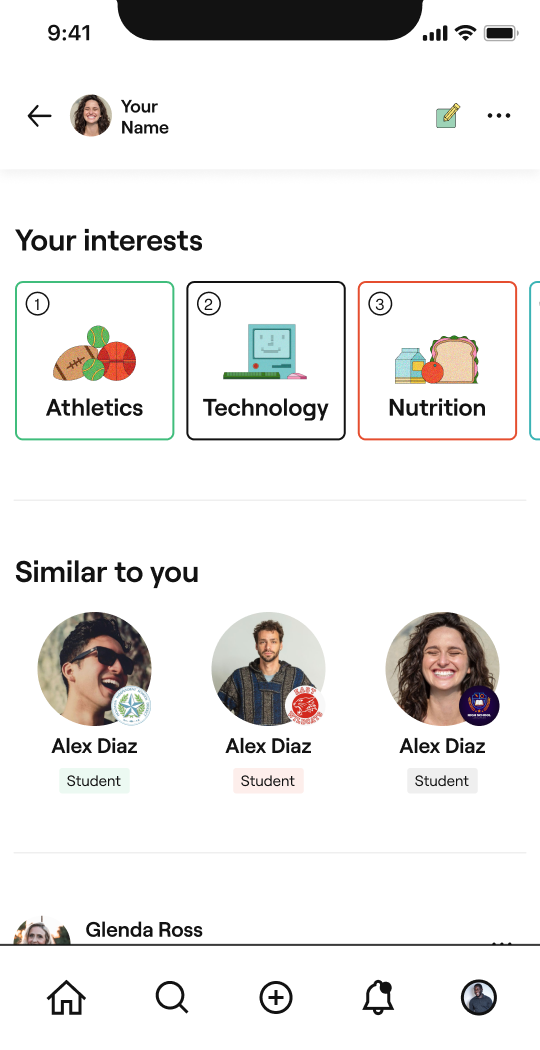
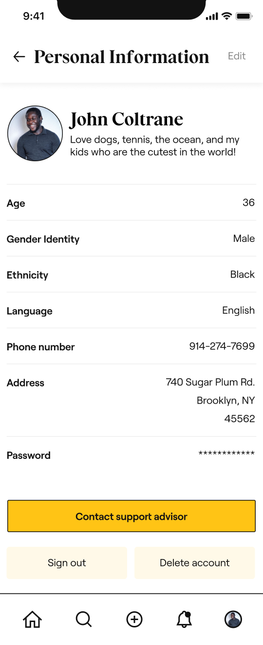
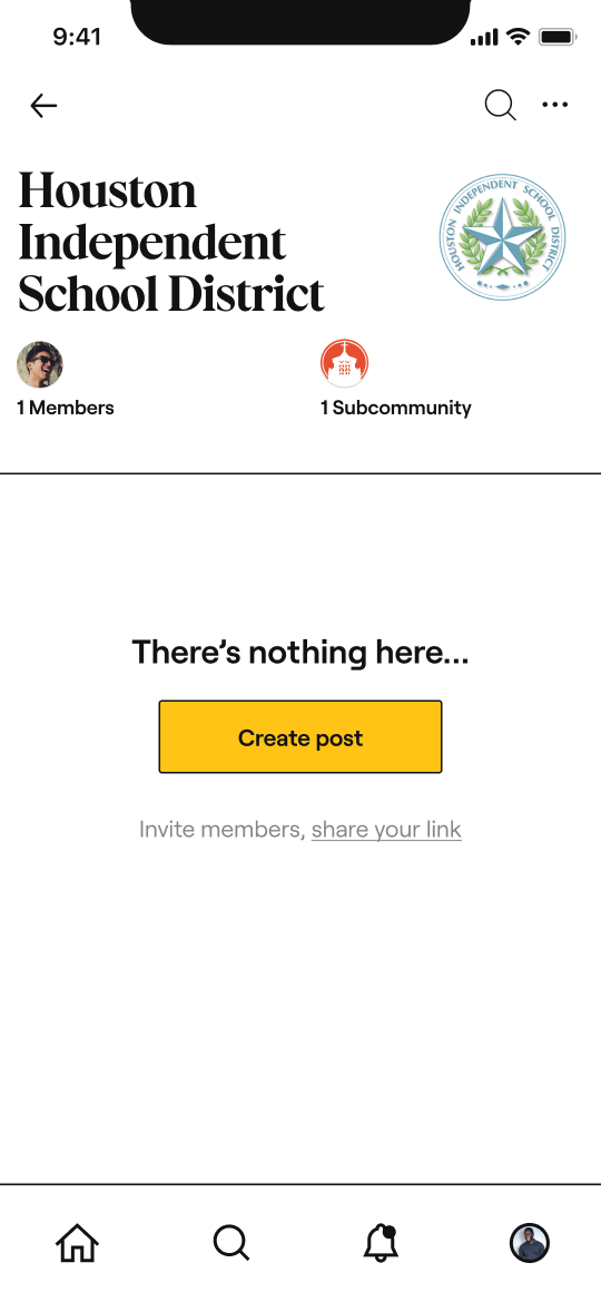
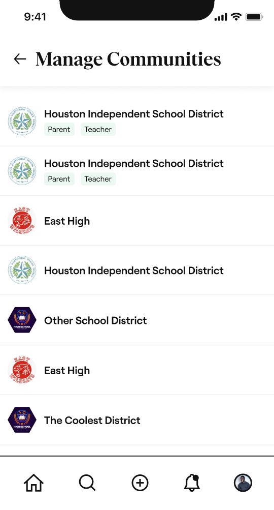
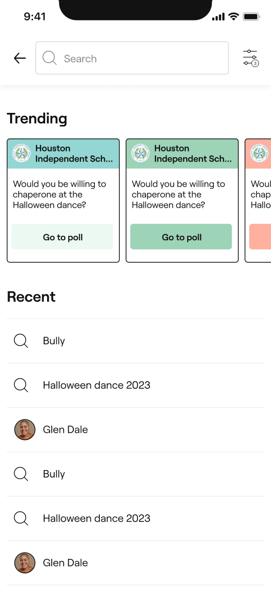
Hi-fi wireframes
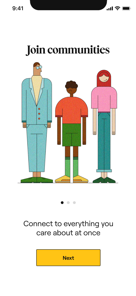

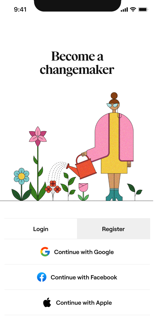
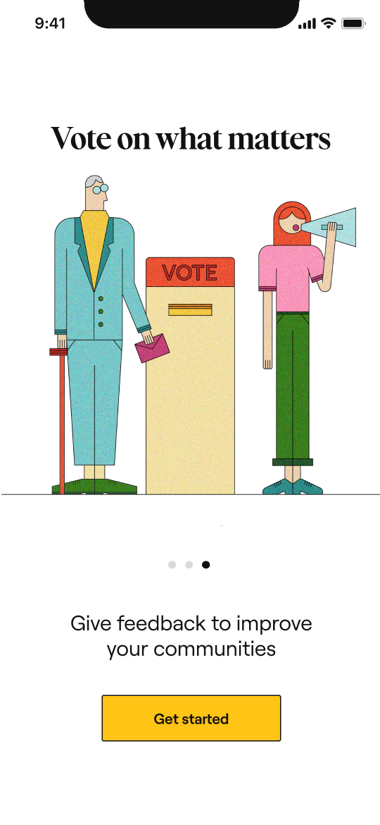
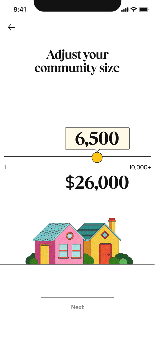



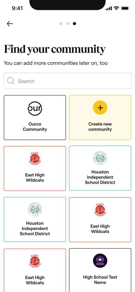
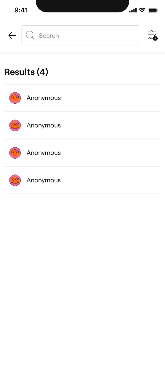
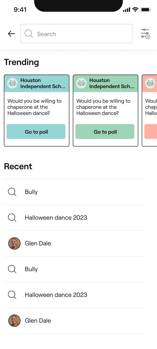
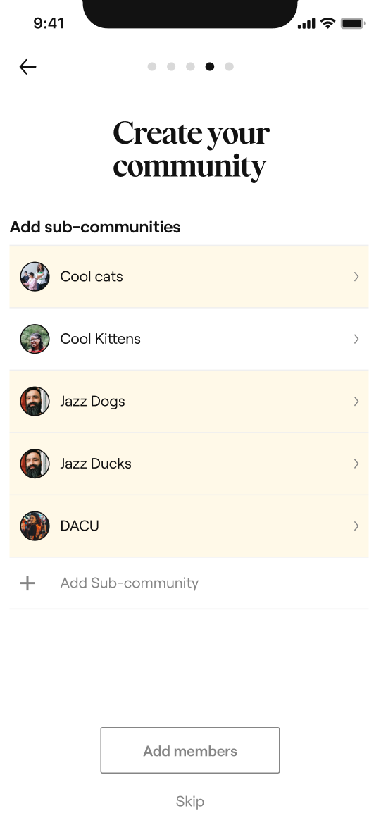
What did work?
Our approach to making the platform as simple and intuitive as possible was highly effective. We streamlined the user interface to ensure ease of use for both employers and employees, minimizing friction at every step.
Illustrations were used strategically to guide users, highlight next steps, and showcase key features, creating a more engaging experience without overwhelming the interface.
What didn’t work?
Initially, we explored more feature-heavy designs, but they ended up overcrowding the platform and confusing users.
Over time, we learned that less was more—by stripping back unnecessary elements and relying on visual cues like illustrations, we achieved a balance between functionality and clarity.


